A unified design system for Bell Canada’s digital products, standardizing UI components, visual language, and interaction patterns across mobile, web, and internal tools—improving consistency, accessibility, and development efficiency.
Content
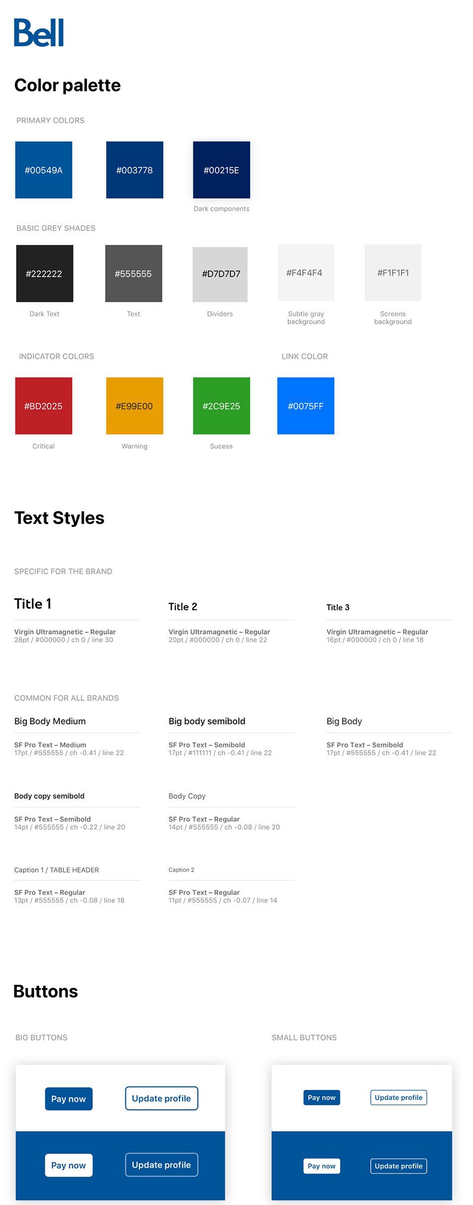
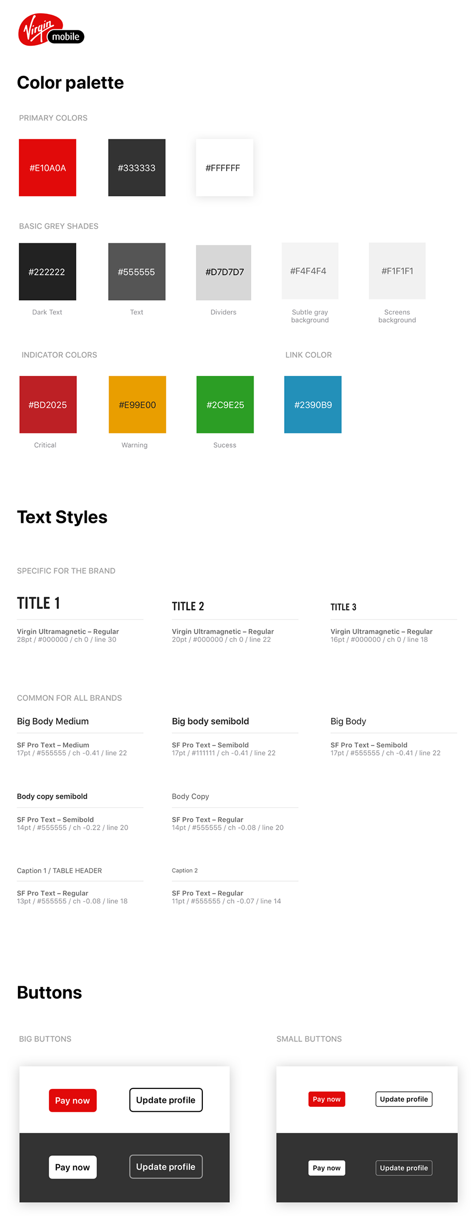
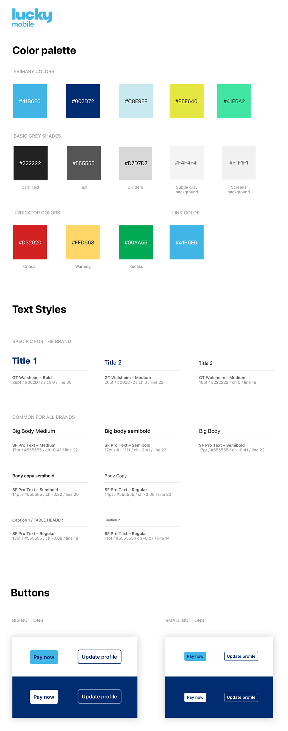
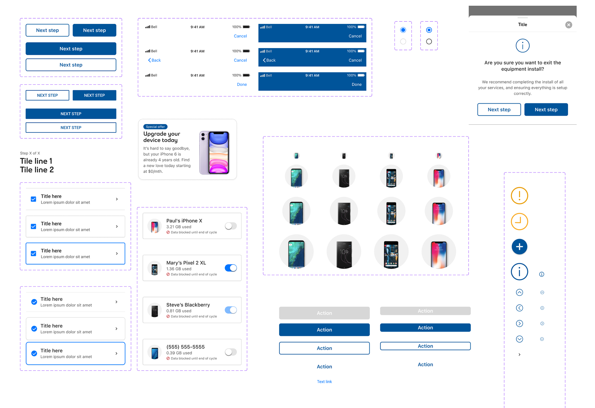
Bell Canada’s digital products—MyBell, e-commerce, self-install guides, and internal tools—used inconsistent styles and patterns, slowing delivery and affecting usability. The Design Systems UI project created a single source of truth across iOS, Android, web, and internal platforms, aligned with brand guidelines and WCAG 2.1 AA. It featured a Figma component library, token-based color, spacing and typography, responsive grids with adaptive behavior, and clear interaction and motion guidelines.
Key Requirements
A master component library in Figma defined Bell’s token-based colour, spacing, and typography system, responsive grid layouts with adaptive behaviours, and clear interaction and motion guidelines. Designers gained reusable, brand-aligned components to focus on solving customer problems instead of rebuilding UI, while developers received a documented, version-controlled library integrated directly with the codebase.
Impact
The design system improved speed-to-market by enabling teams to assemble pages from standardized components rather than creating them from scratch. It reduced UI defects, improved accessibility compliance, and provided a consistent user experience across Bell’s products.
By centralizing updates in the design system, Bell achieved visual consistency and streamlined collaboration between product, design, and development teams—ultimately making digital service delivery faster and more cohesive.